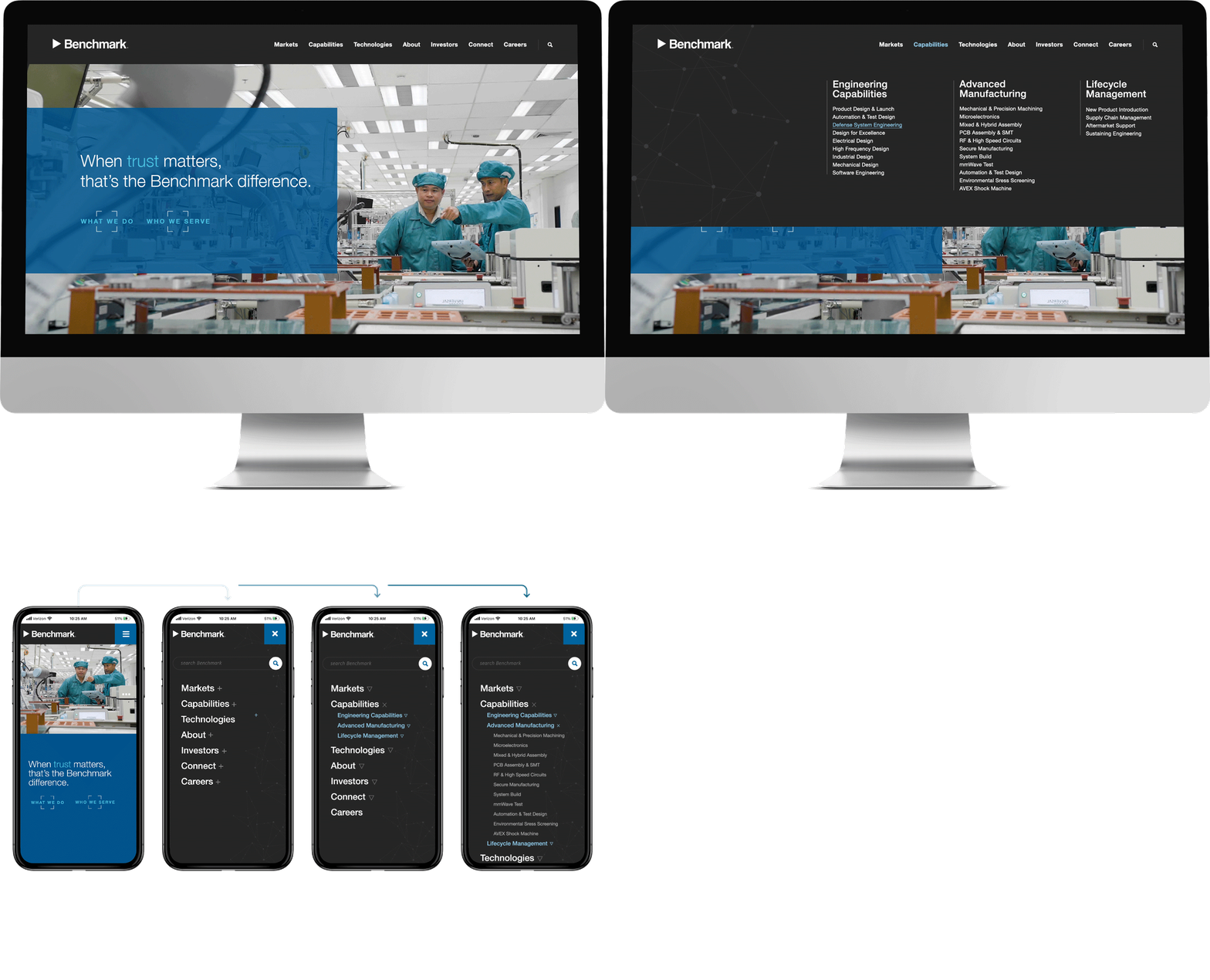
The final chosen design utilized a large, but not full-screen dropdown with a clean column structure. The mobile experience was similarly organized to maintain consistency, with an expanding sub-level approach.

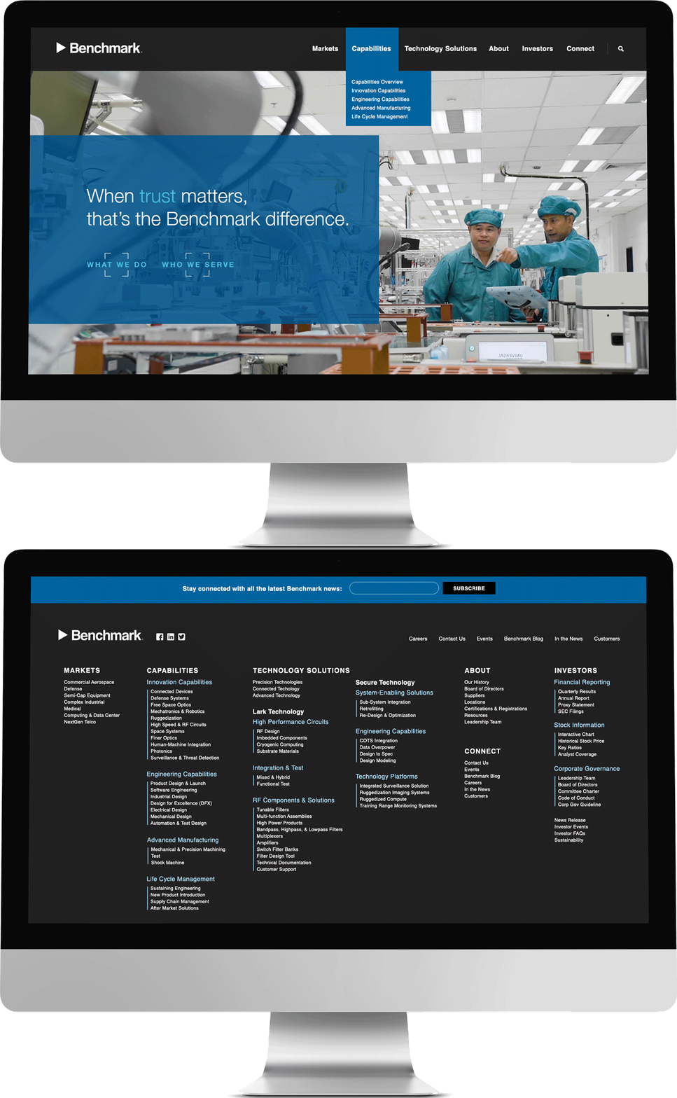
As an exploration on the opposite side of the complexity spectrum, we considered a dramatically scaled-back version of the navigation to guide users toward key starting pages for the most important topics/sections, providing a deeper link list in the footer for the regular visitors who knew what they were looking for.
Benchmark Web Navigation
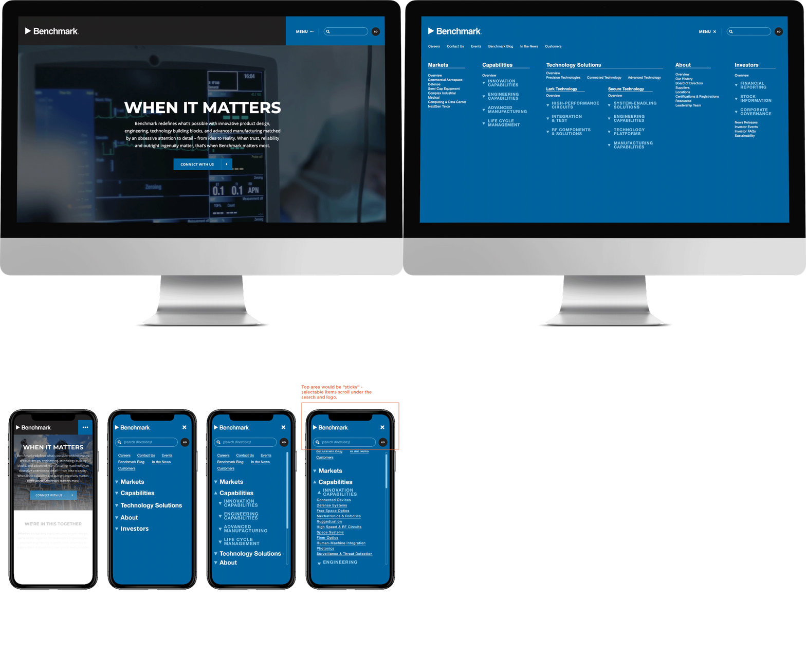
At Stratagon, our client had a huge website and the navigation was difficult to use. Working with "very particular" decision makers on the client side and our talented developer, we explored a range of solutions in pursuit of a more streamlined experience.


