
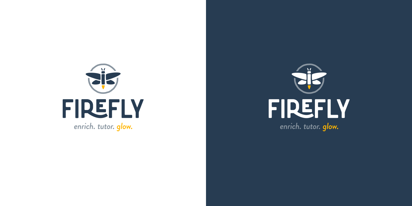
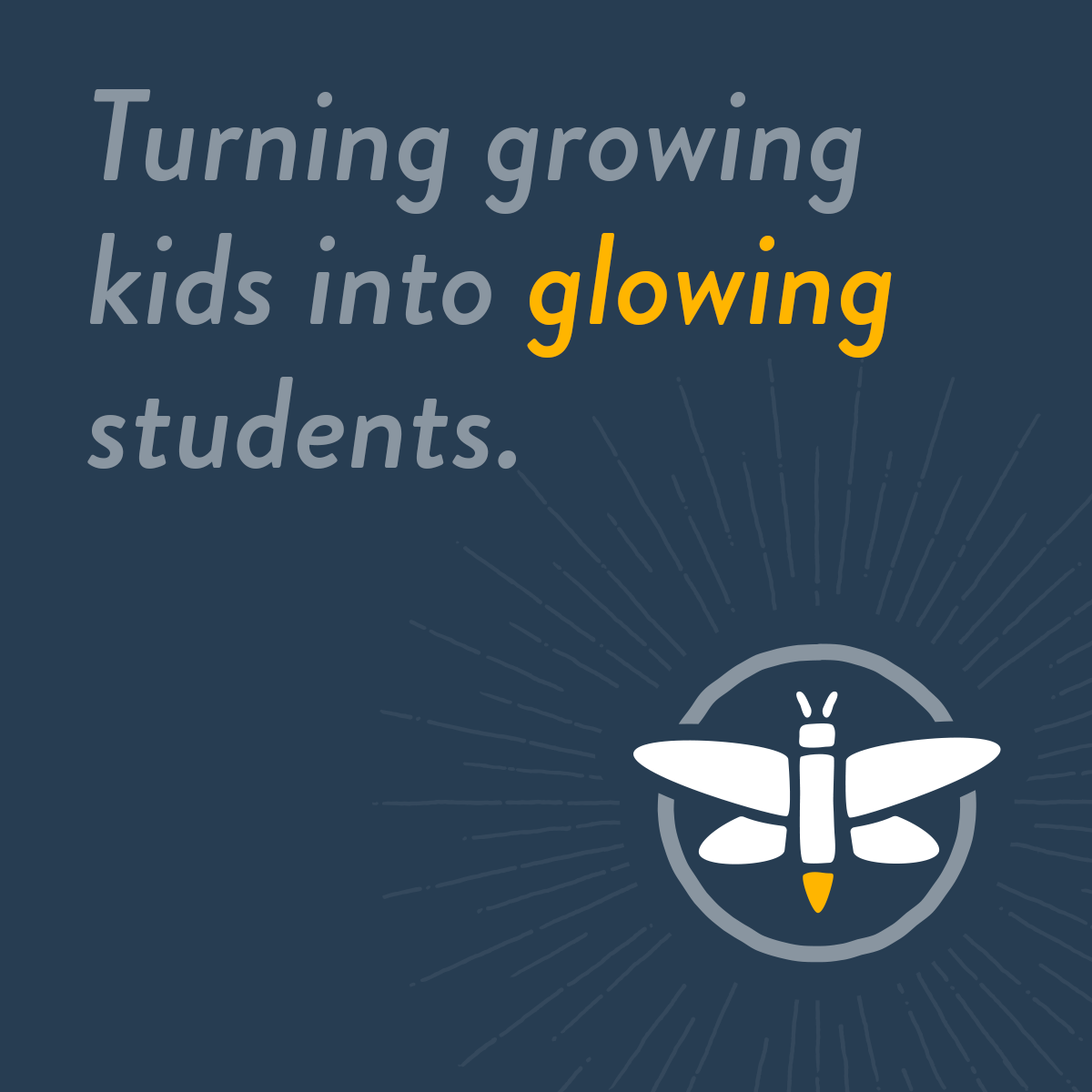
Initially called "Firefly Enrichment", we saw the opportunity to simplify the official name and communicate the service in supplemental ways, including this tagline which offers more of an inspirational tone. The target audience boils down to the parents who want to see their child glow (whether to "catch up" from being a bit behind or to get ahead for those not challenged enough in their scholastic experience).
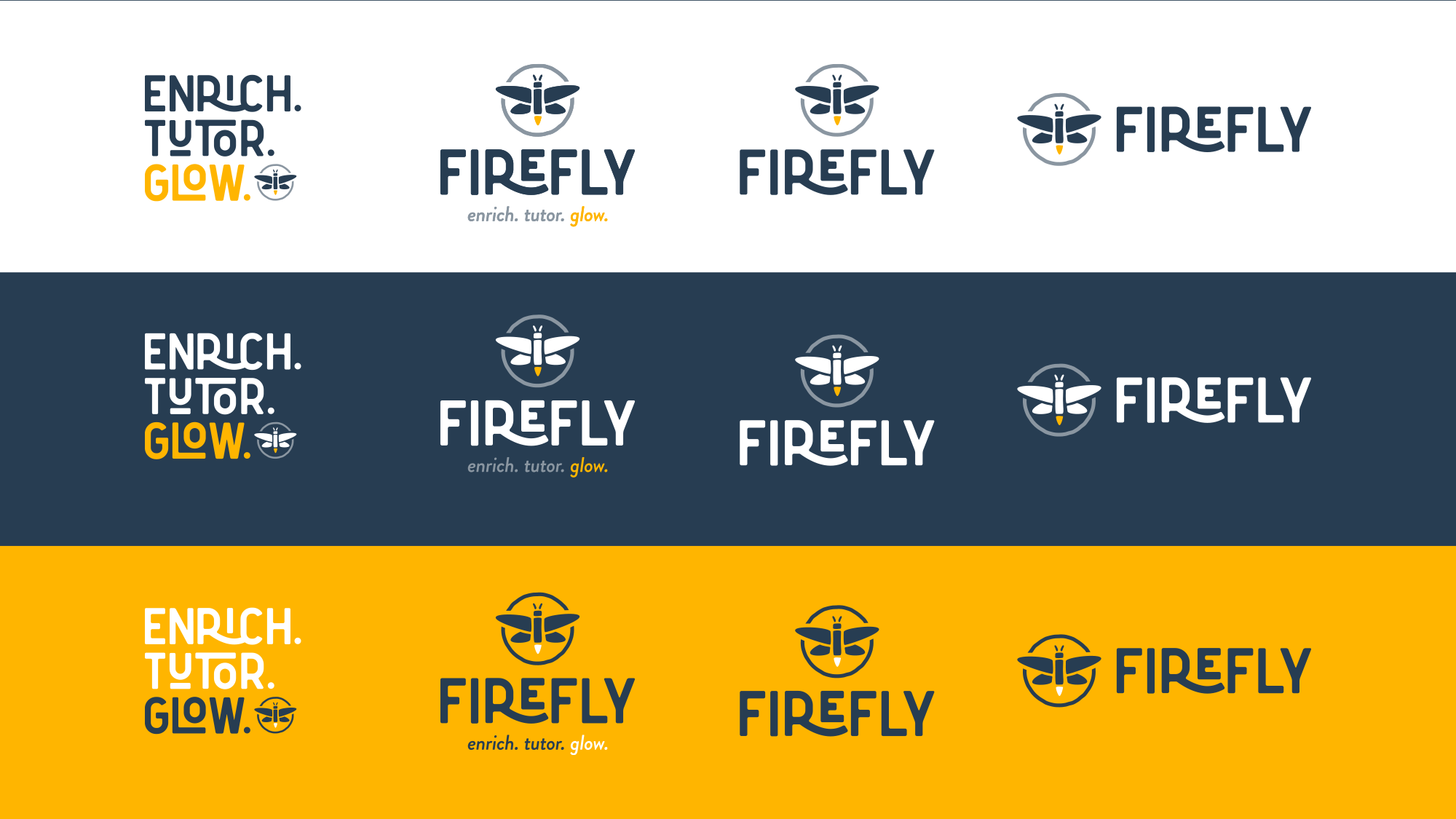
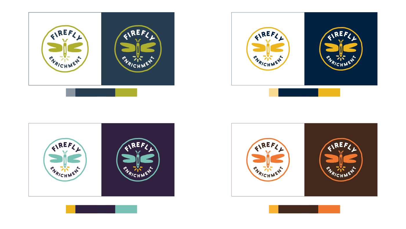
The initial bug/crayon concept. We agreed this was an interesting idea but felt a bit too childlike in style and risked being viewed as a daycare without the legitimate educational aspect of her services. Taking the typographic elements from another presented concept and tightening up the overall symbol, the client was thrilled with the final solution.
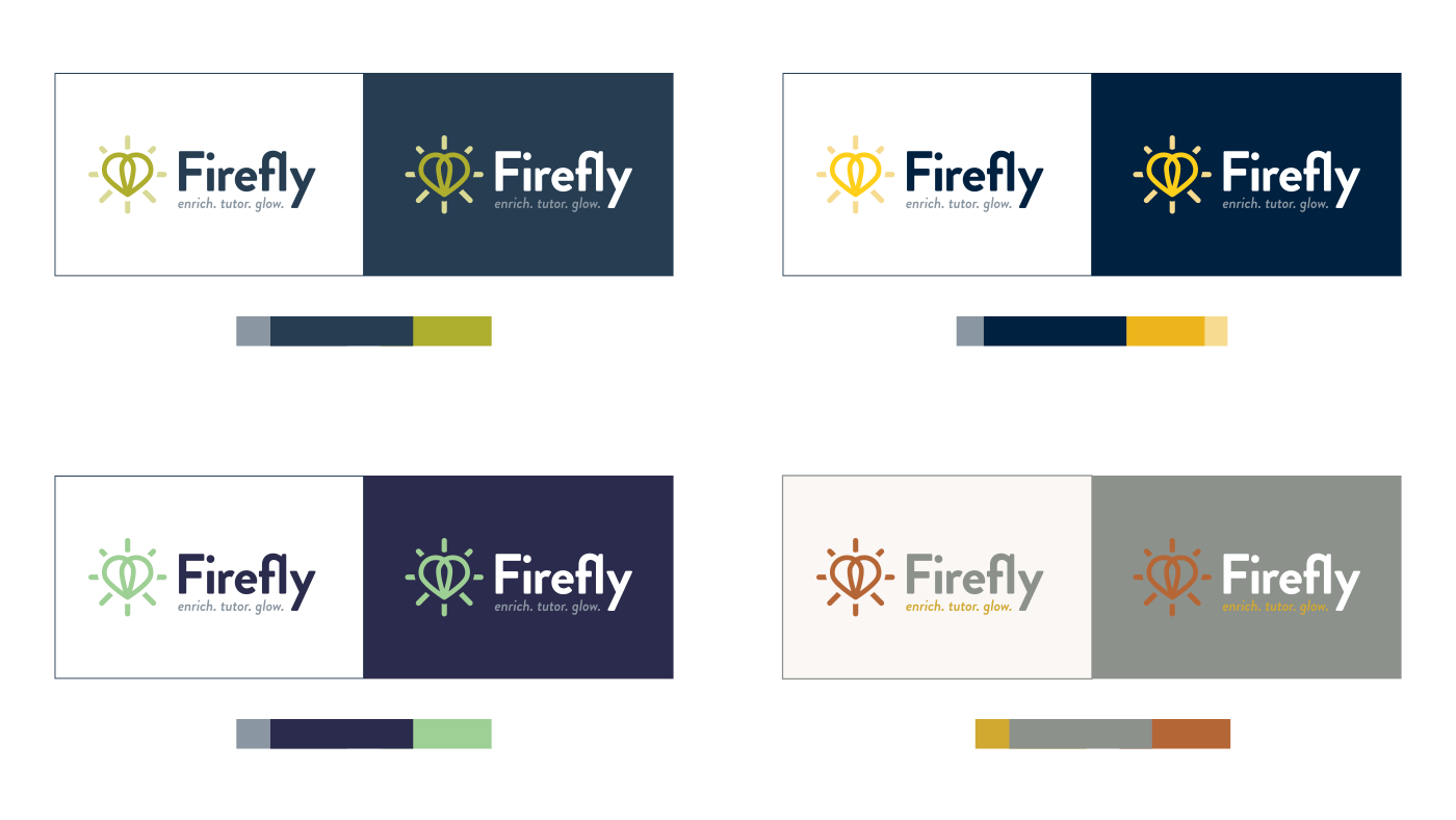
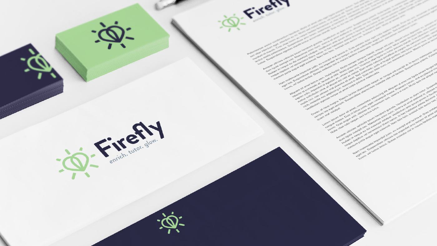
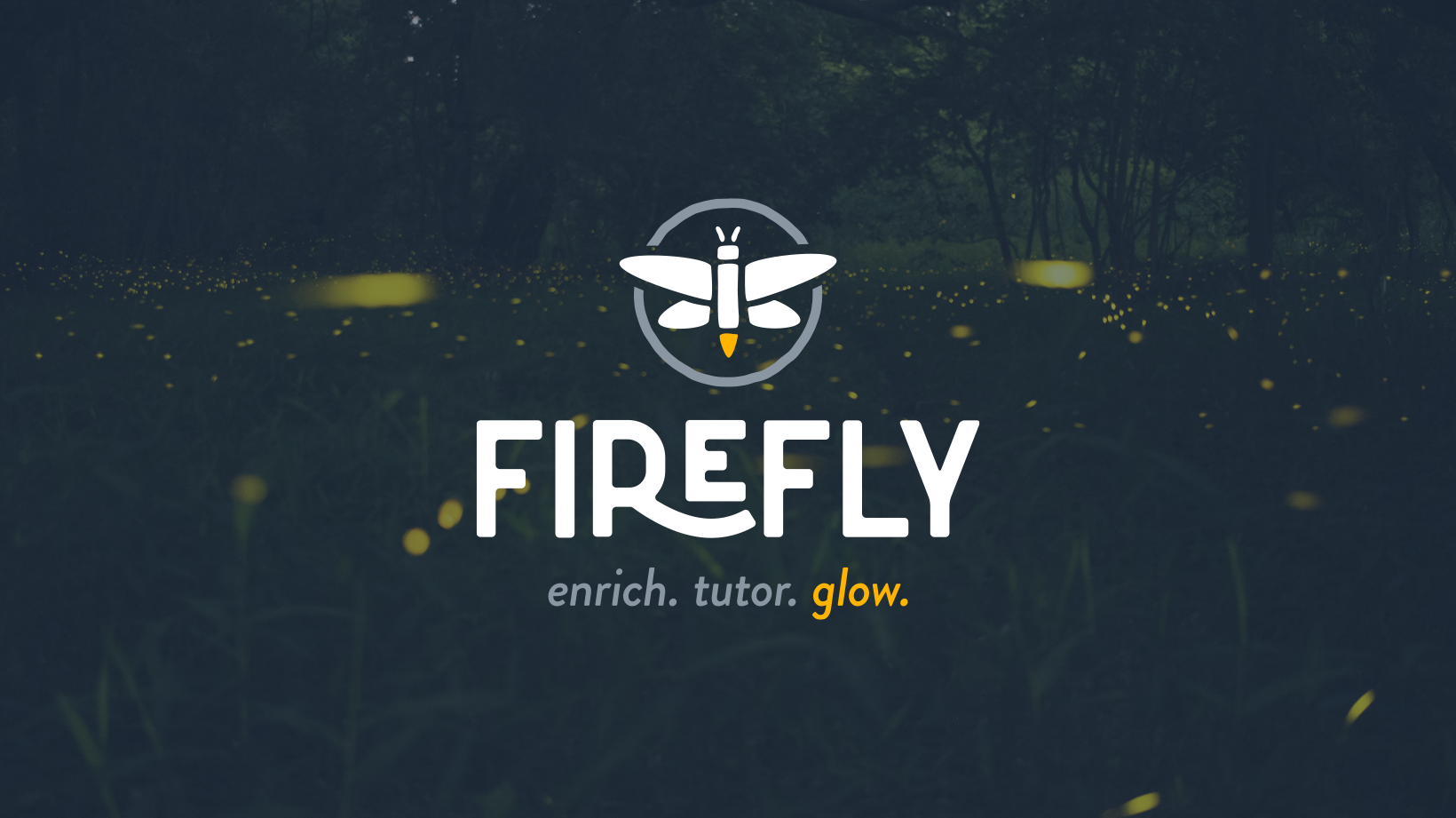
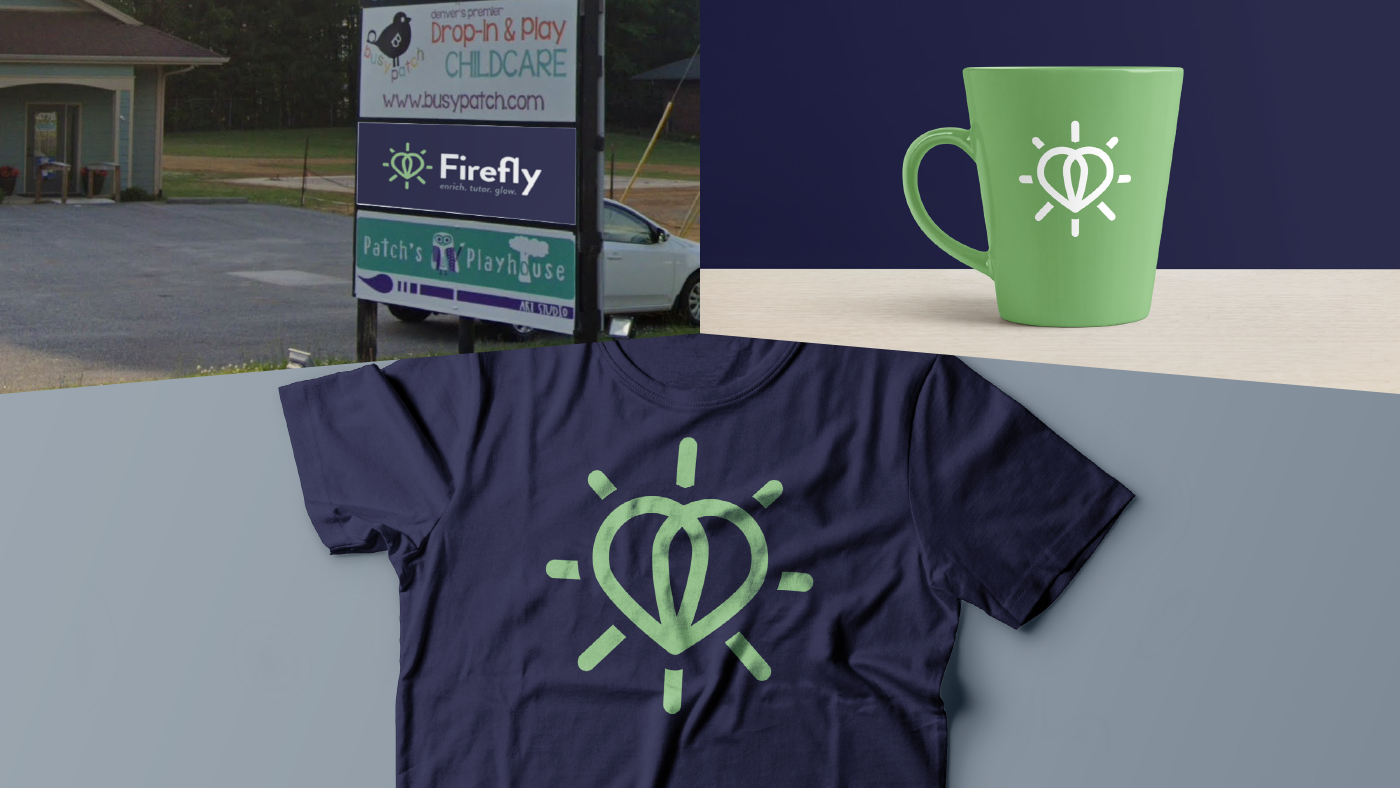
An abstract representation of a firefly's wings, the illuminated symbol also comes together as a heart to highlight the sincere love & care the organization puts into each and every student.
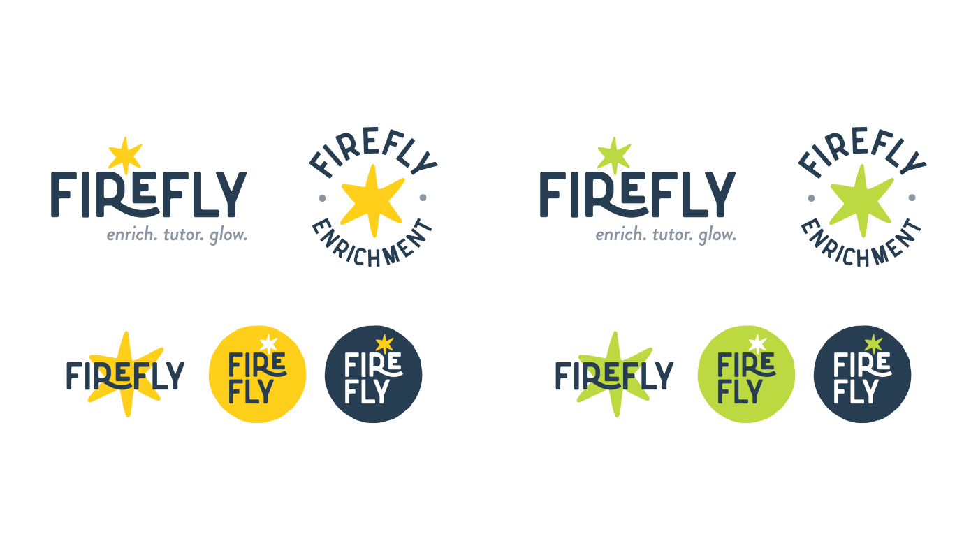
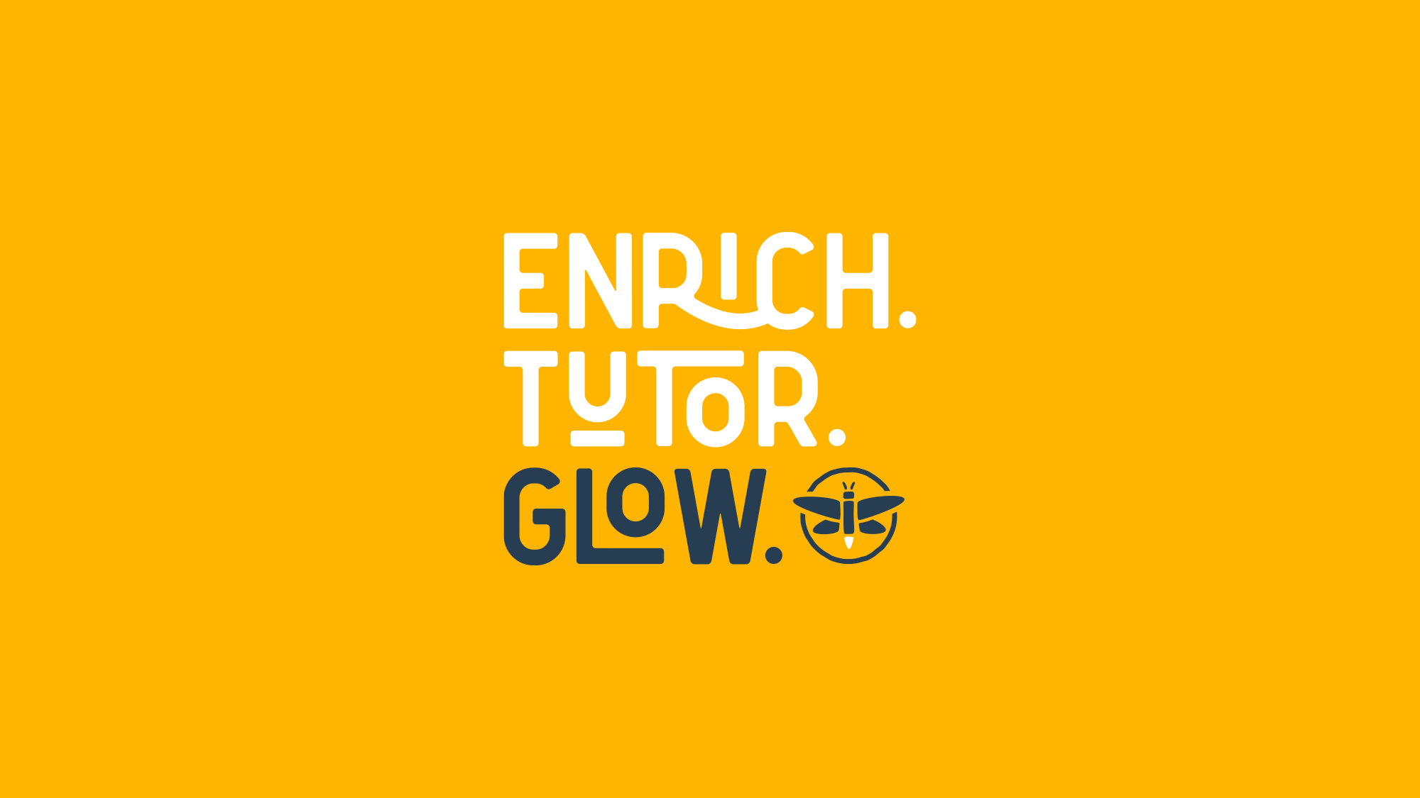
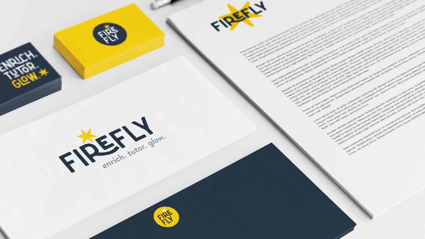
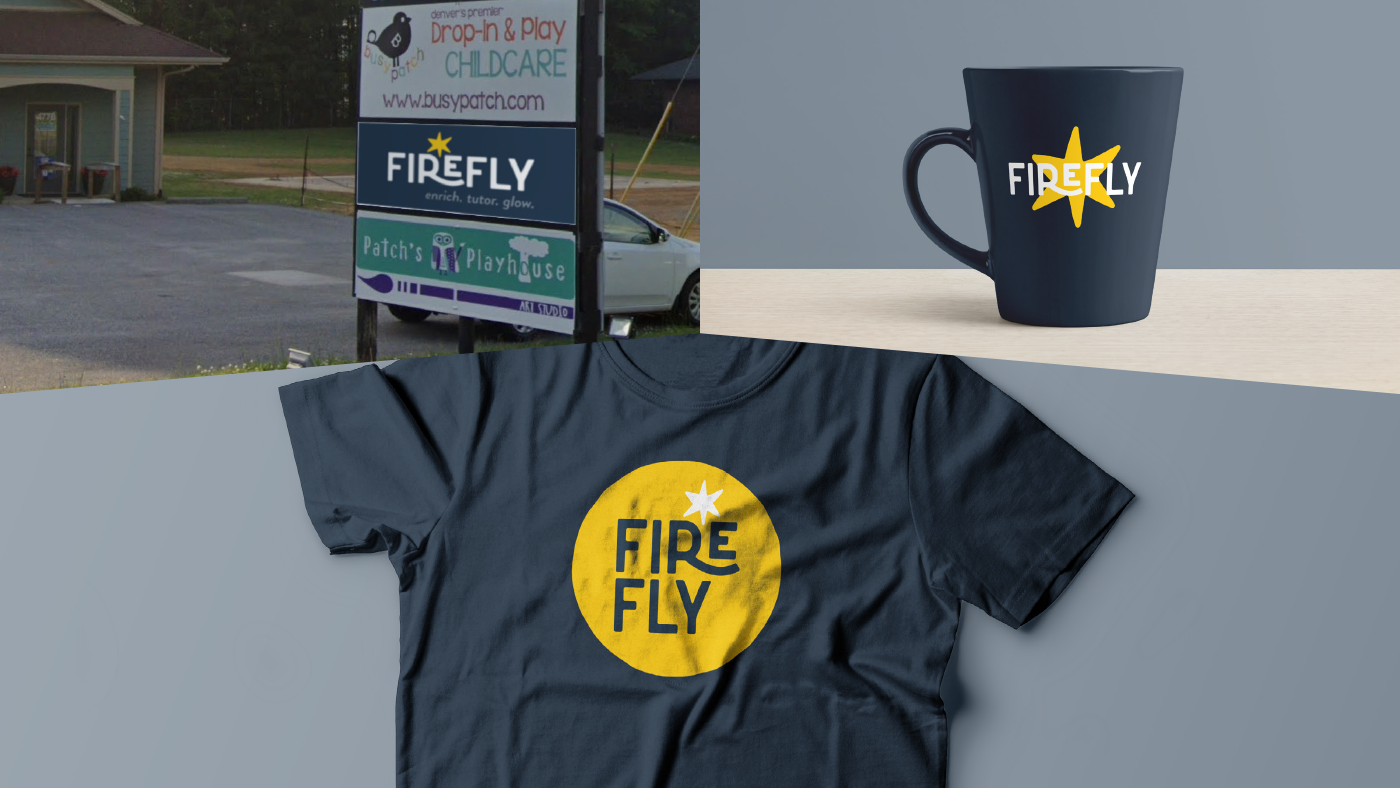
The most abstract concept, this zoomed entirely into the glow aspect of what a firefly represented to the client, creating a simple & playful burst of energy that offered a range of flexibility for implementation. The client loved the typography and bold golden color which found their way into the final solution.
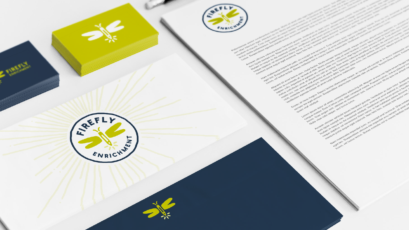
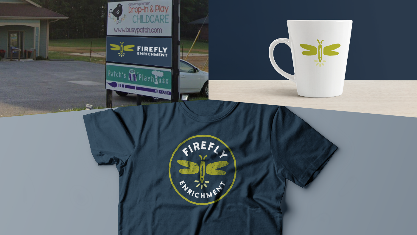
Firefly Enrichment Tutoring Logo Design
A small project for a local startup. The client explained the name was chosen as a representation of the guiding light she envisioned her service to be, not as over-the-top as a lighthouse but more subtle and supplemental to her students' journeys, like a small & dependable spirit.
The final concept landed a bit more literally than I was trying to guide her toward, but the somewhat hidden combination of a firefly shape with a crayon strongly resonated with her and became a memorable solution.


