
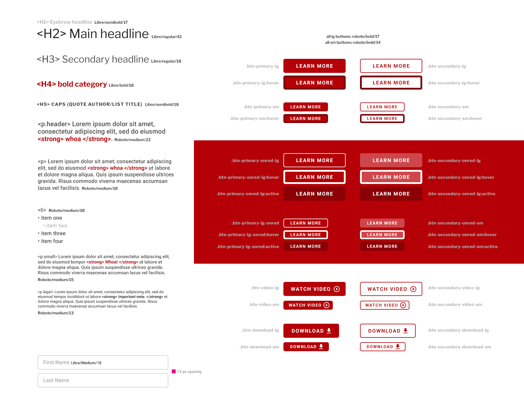
With my unique interest in the technical side of web, I provided the development team with deep and detailed assets and guidelines to help standardize the web presence which was very inconsistent.
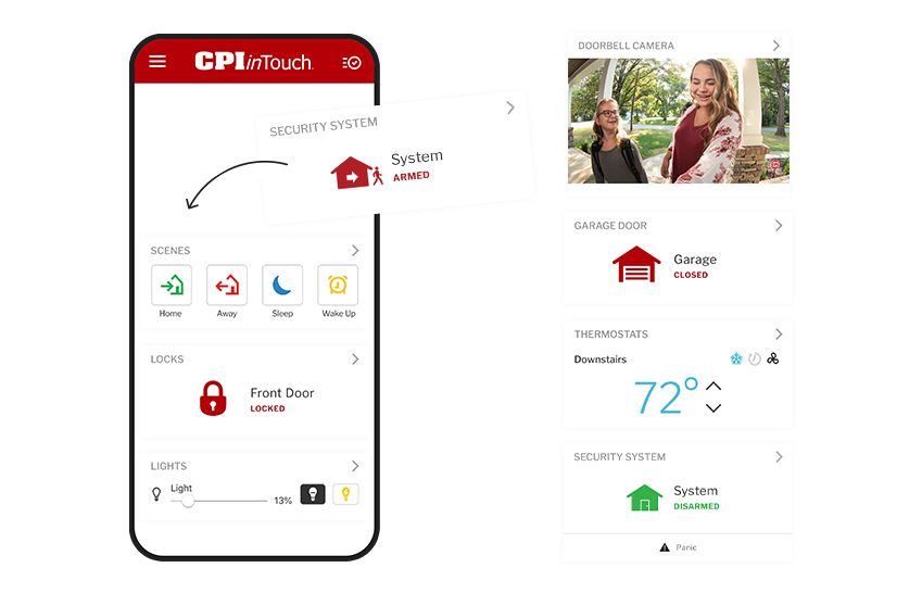
I'm always thinking about systems to save time. After a few requests to manipulate app screenshots to meet the marketing need, I created a system of all app elements to build custom layouts very quickly.
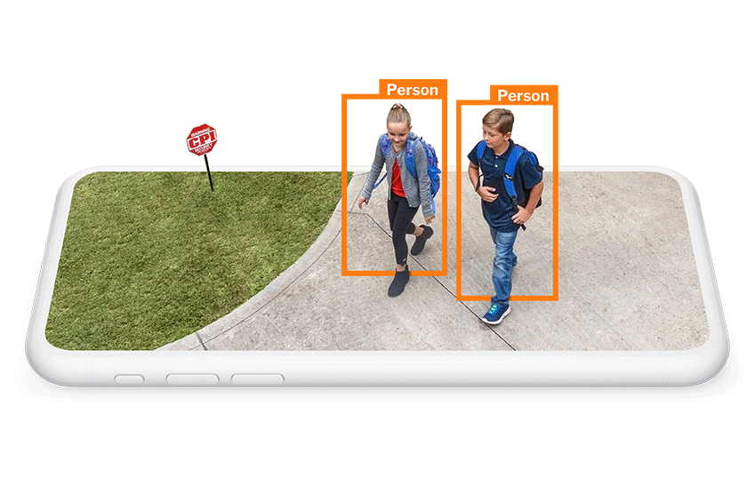
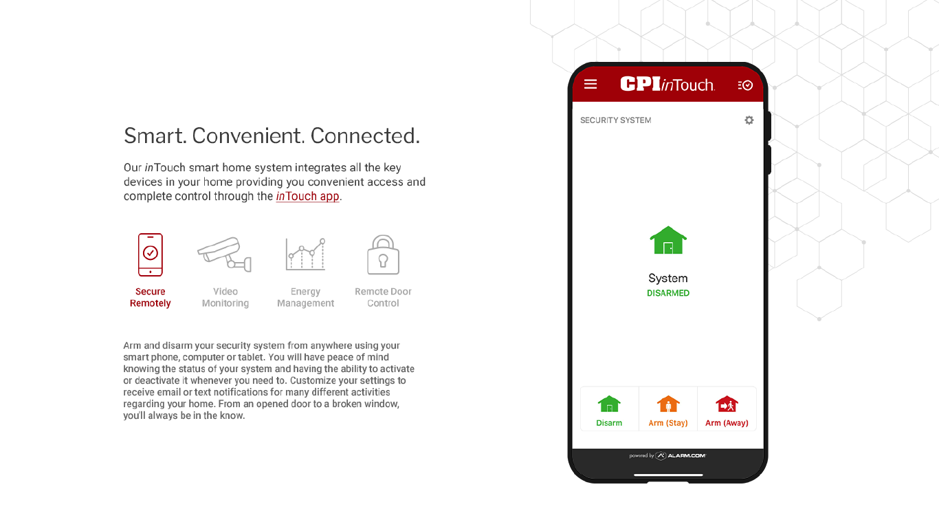
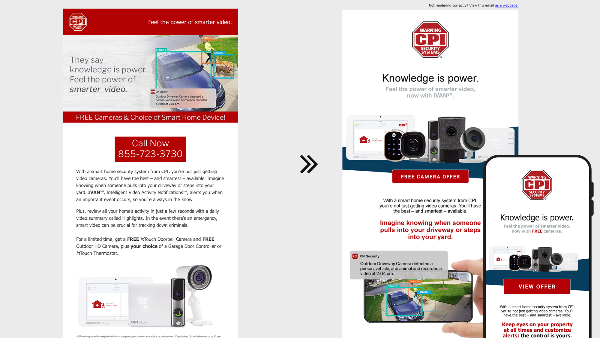
To help add life to their AI-based video monitoring functionality, I built a system of assets that visualized the alerts reaching beyond their cell phone base, making a visually compelling solution that could be iterated while maintaining consistency across implementations.
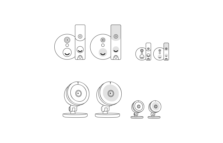
To supplement product photography, I created a responsive-ready SVG library that maintained sizing ratios in a range of variations that could be easily combined.
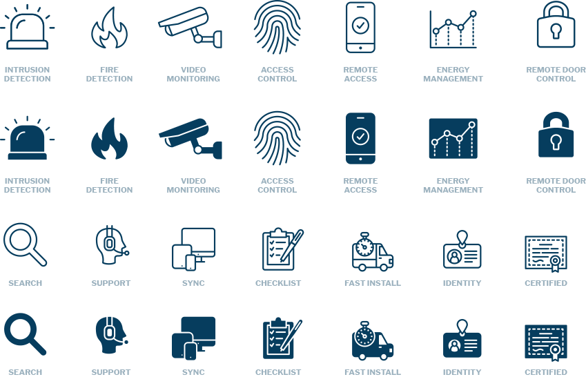
Icons on the site were previously inconsistent, non-scalable, and sometimes very confusing. A simple approach to providing key iconography helped establish consistency, .svg format allowed for more effective implementation/scalability, and alternate styles provided a range for creative usage.
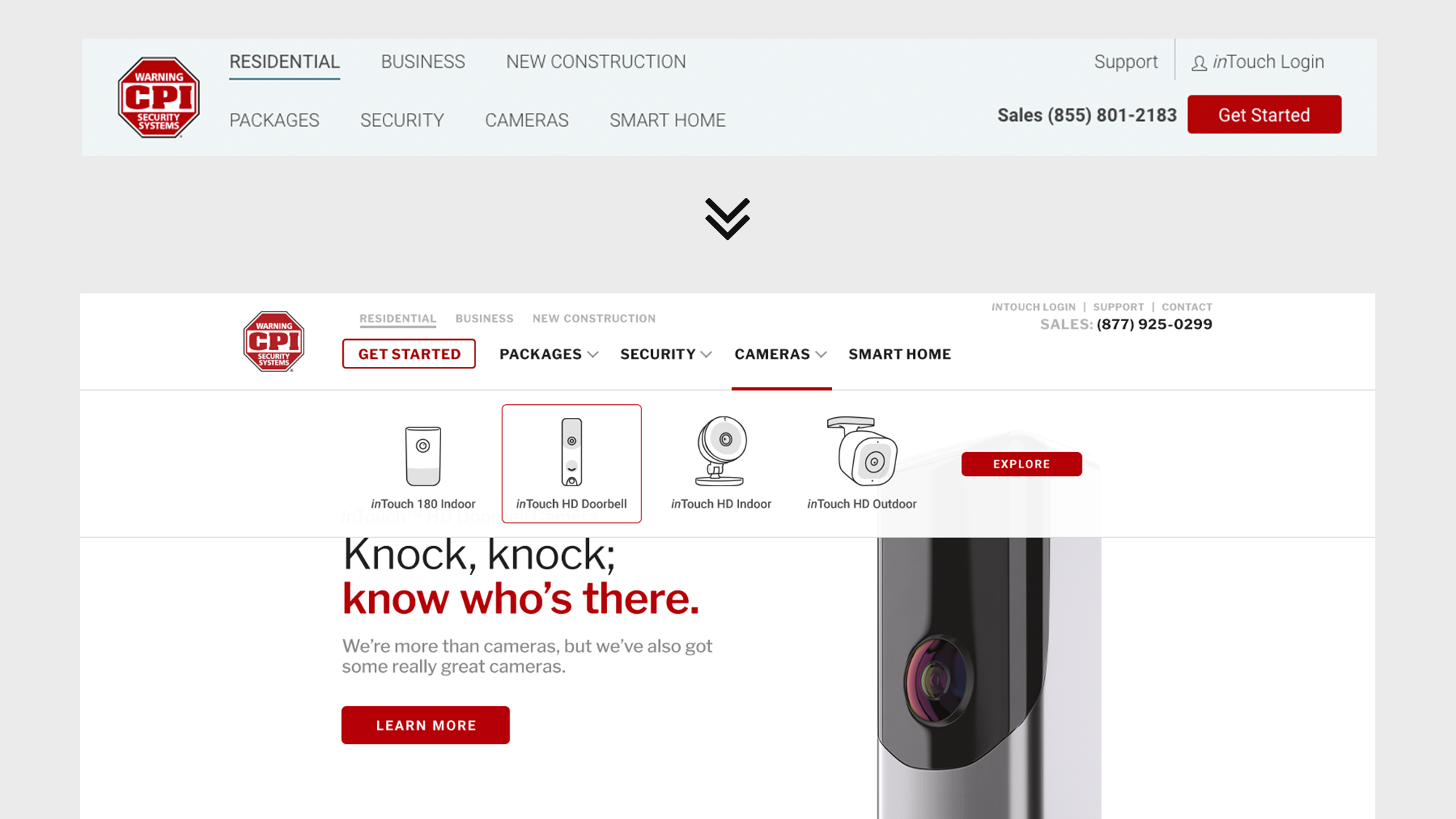
Arguably the most important aspect of web design, navigation was a critical exploration in uplifting user experience. Bringing the most critical CTA ("get started" button) to the left-hand side kept it in high visibility while contrasting typographic hierarchy clarified the organization of the site.
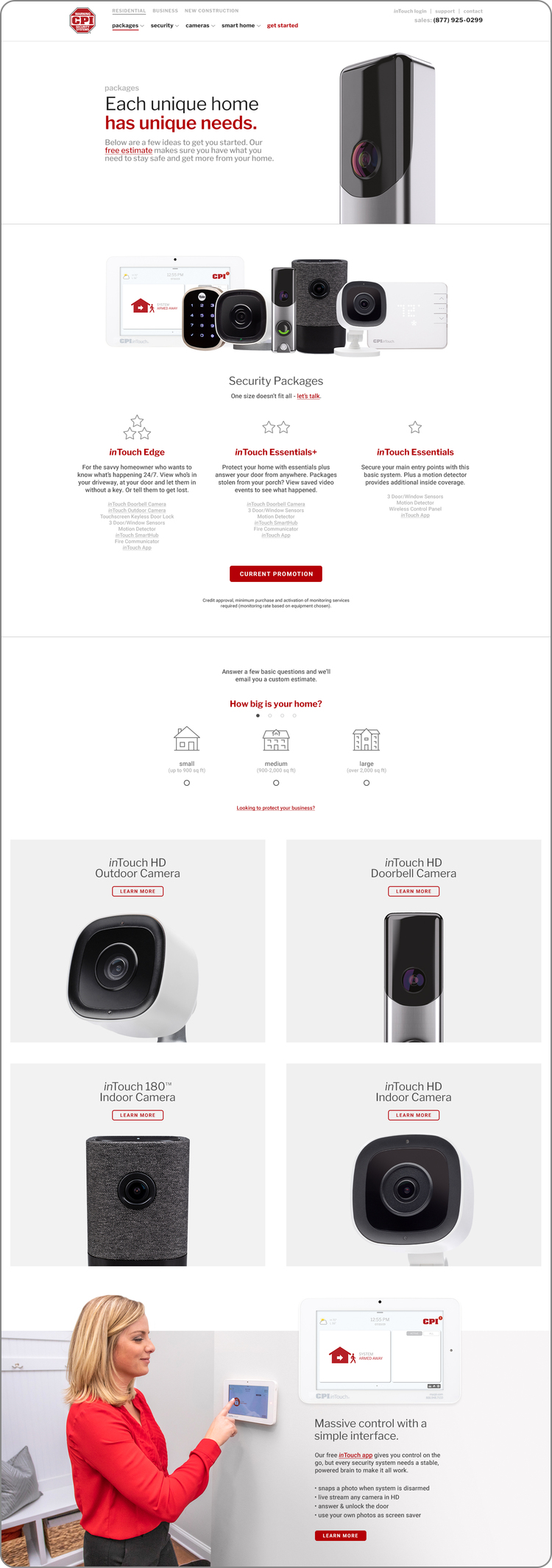
The dropdown concept above utilized my responsive product vectors, while other text-only versions were developed as well.
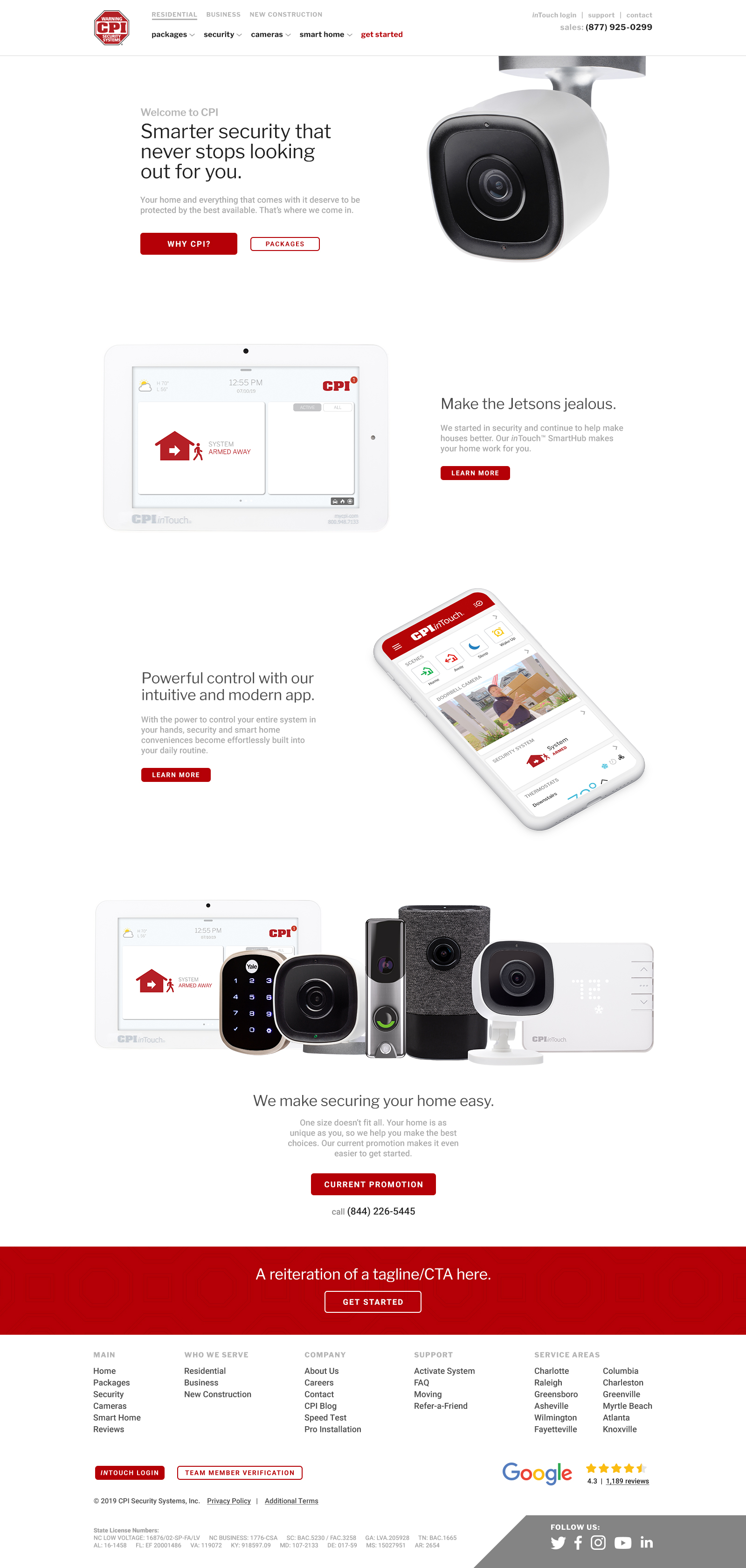
While my main directive was to update the existing site, I also developed an entirely revamped concept for executive consideration. The new version utilized much more white space to allow product shots to feel higher-end paired with clear & simple typography and subtle personality uplift to the copy.
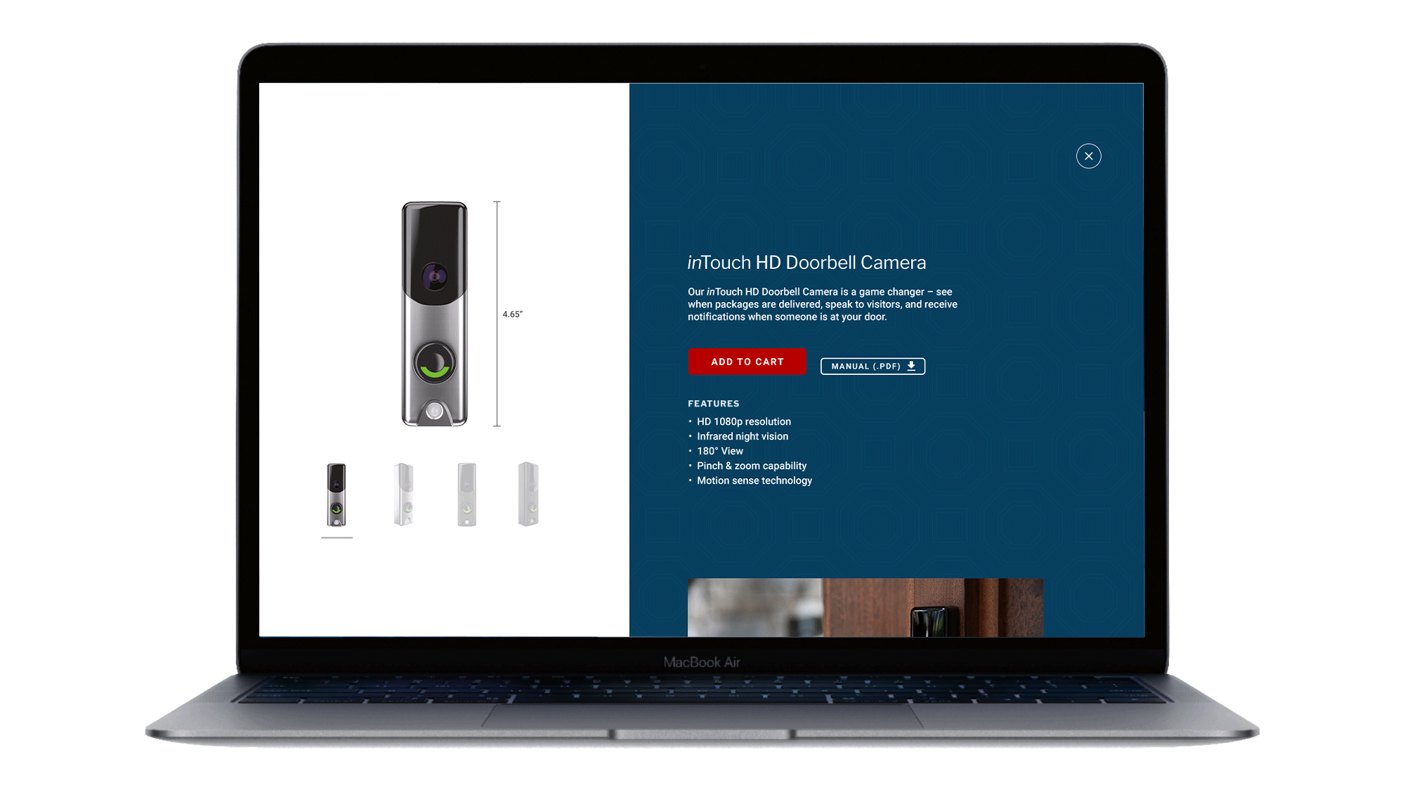
To help prospective customers go deeper into each product, I proposed an immersive product "zoom in" experience that would utilize a fullscreen takeover, allowing the user to easily get right back to the page they were on. (E-commerce was actively being considered so I did include basic "add to cart" elements during certain explorations to keep that in our collective awareness.)
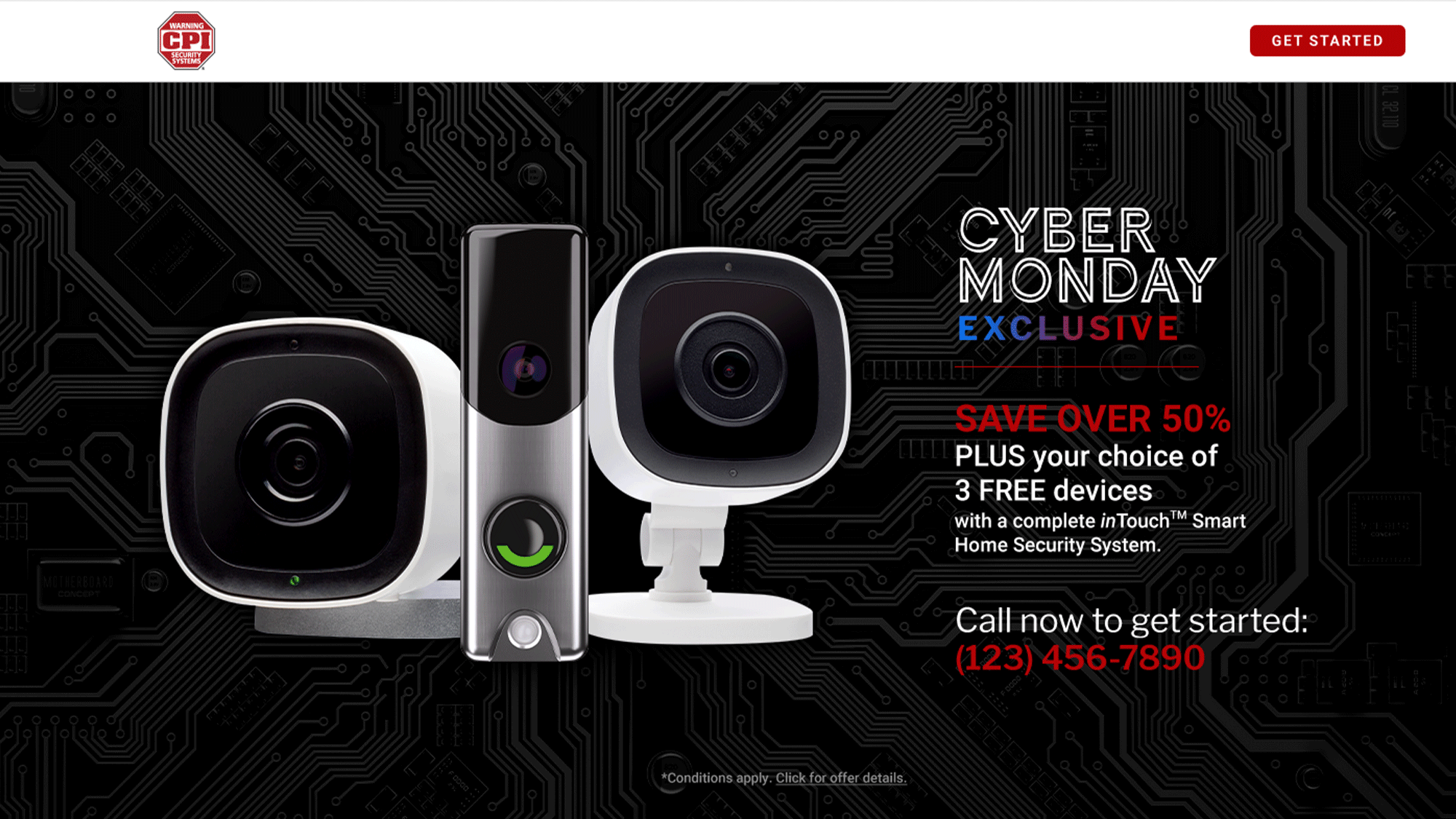
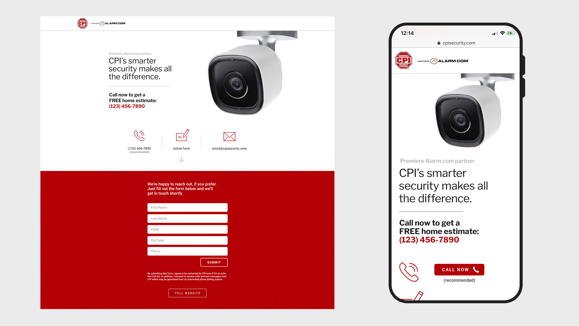
Often there was a need for deal-specific landing pages. Suggestions to make these pages shorter were disregarded, so I emphasized the main "impact hero", keeping secondary material as digestible as possible.
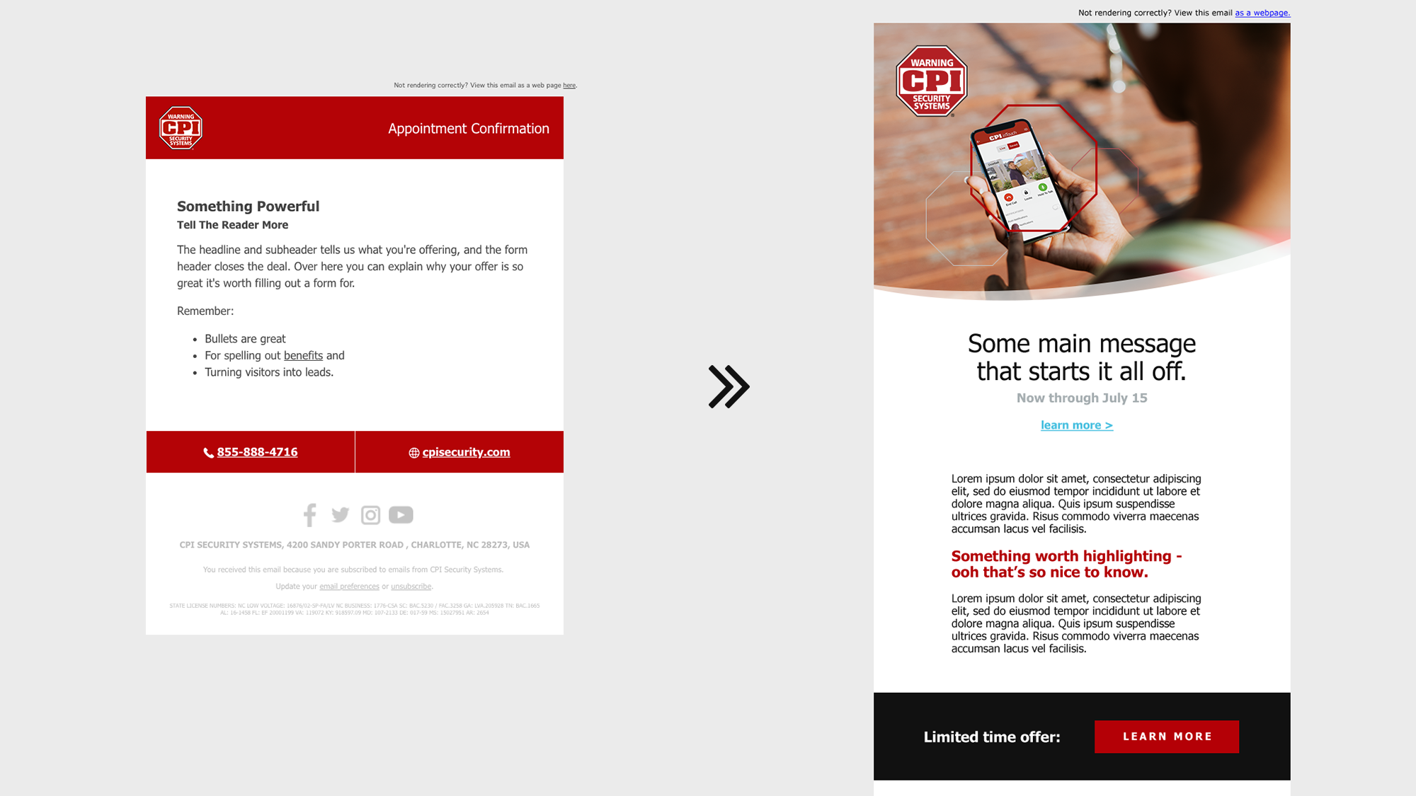
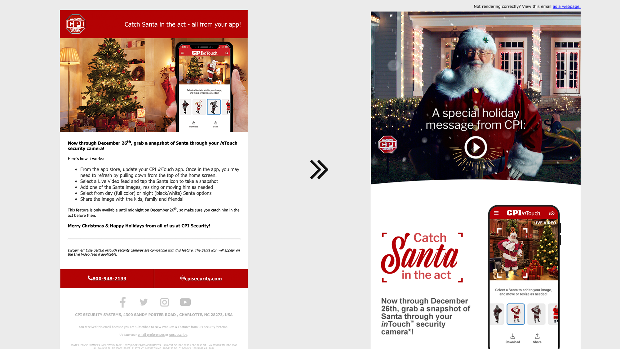
Many email templates were revisited to uplift overall quality, optimize responsive rendering, improve user experience, and drive action.
CPI Security Digital Design
During a short-term role, I was able to create dramatic impact in the digital space of this powerful regional security organization.
Working as a liaison between the marketing and IT departments, I was able to elevate creative output while "speaking the language" of developers in a way that allowed both sides to be empowered.


