
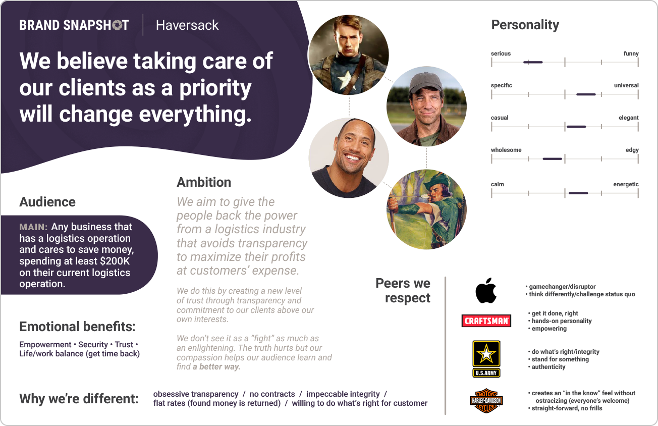
The brand discovery process resulted in this "snapshot" - brand strategy at-a-glance to ensure mutual alignment and intentionality.
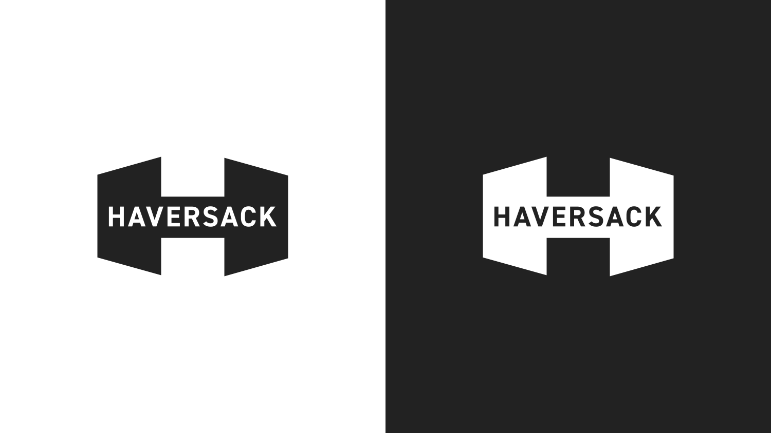
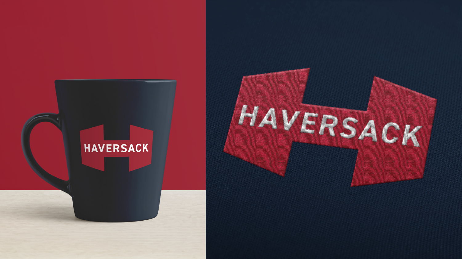
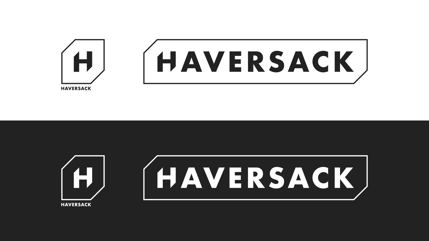
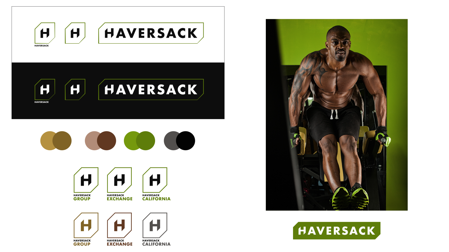
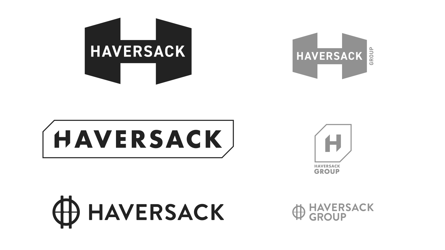
Above is the final selected logo, shown in black & white. Heavy and masculine, the solution has sharp inward-facing angles that feel authoritative, paired with modern all-caps typography.
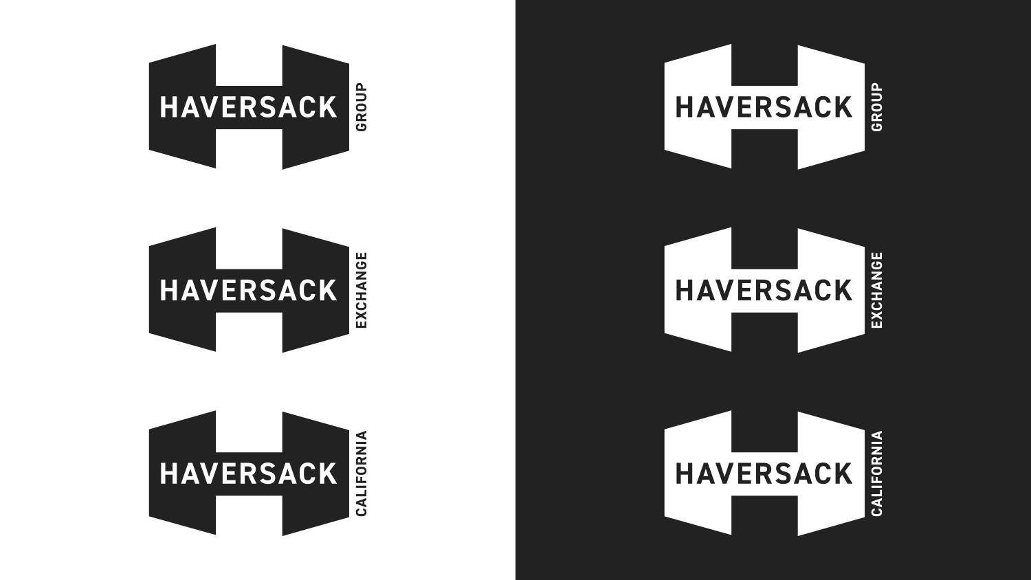
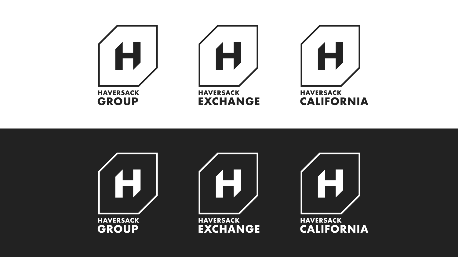
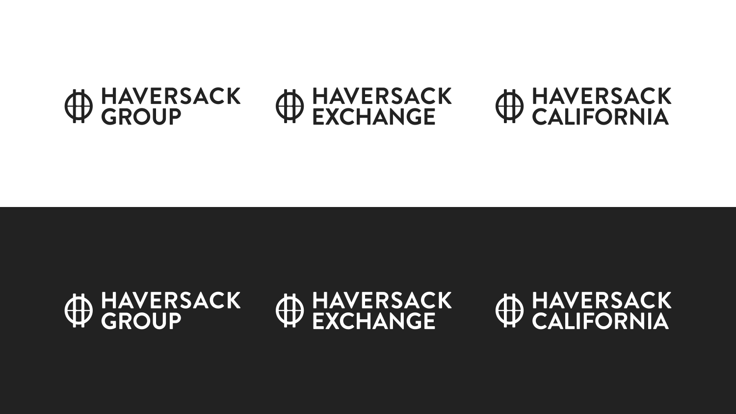
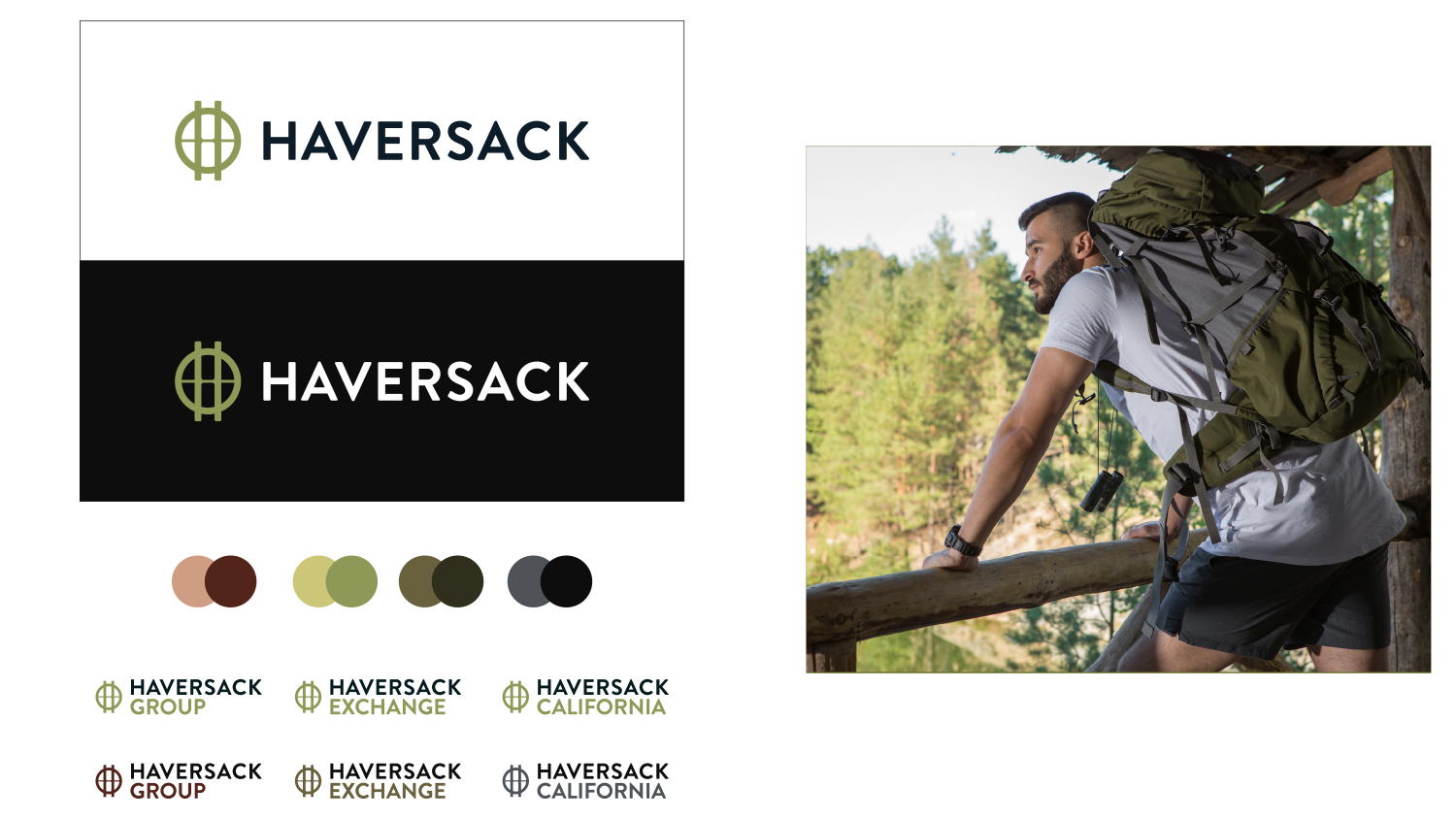
While an expanded brand architecture was not part of the original scope, we were asked to pivot and provide all solutions with variations that included a range of secondary typography elements. Ultimately, we were successful in convincing the client this choice complicated things unnecessarily.
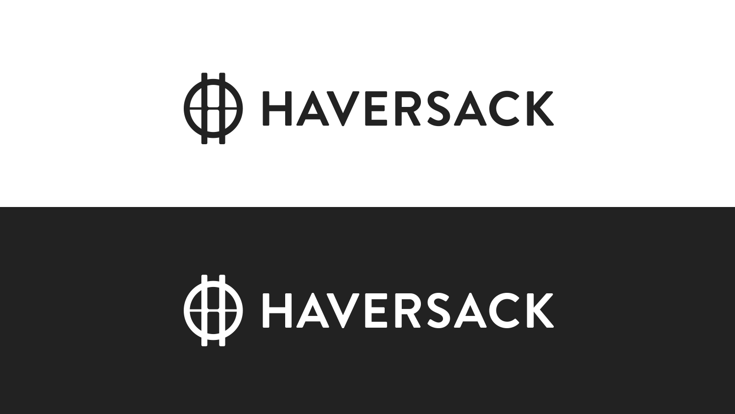
The above solution utilized a modular logo element around the entire logotype. The intent was to reinforce the concept of adaptability, aligning with the company's vision of revolutionizing established practices within their industry.
The third concept drew its inspiration from a crosshair, symbolizing a deliberate aim toward transforming the legacy industry. The deliberate use of rounded edges in the selected typeface tempered any potential over-aggressive connotations, resulting in a compelling yet poised personality.
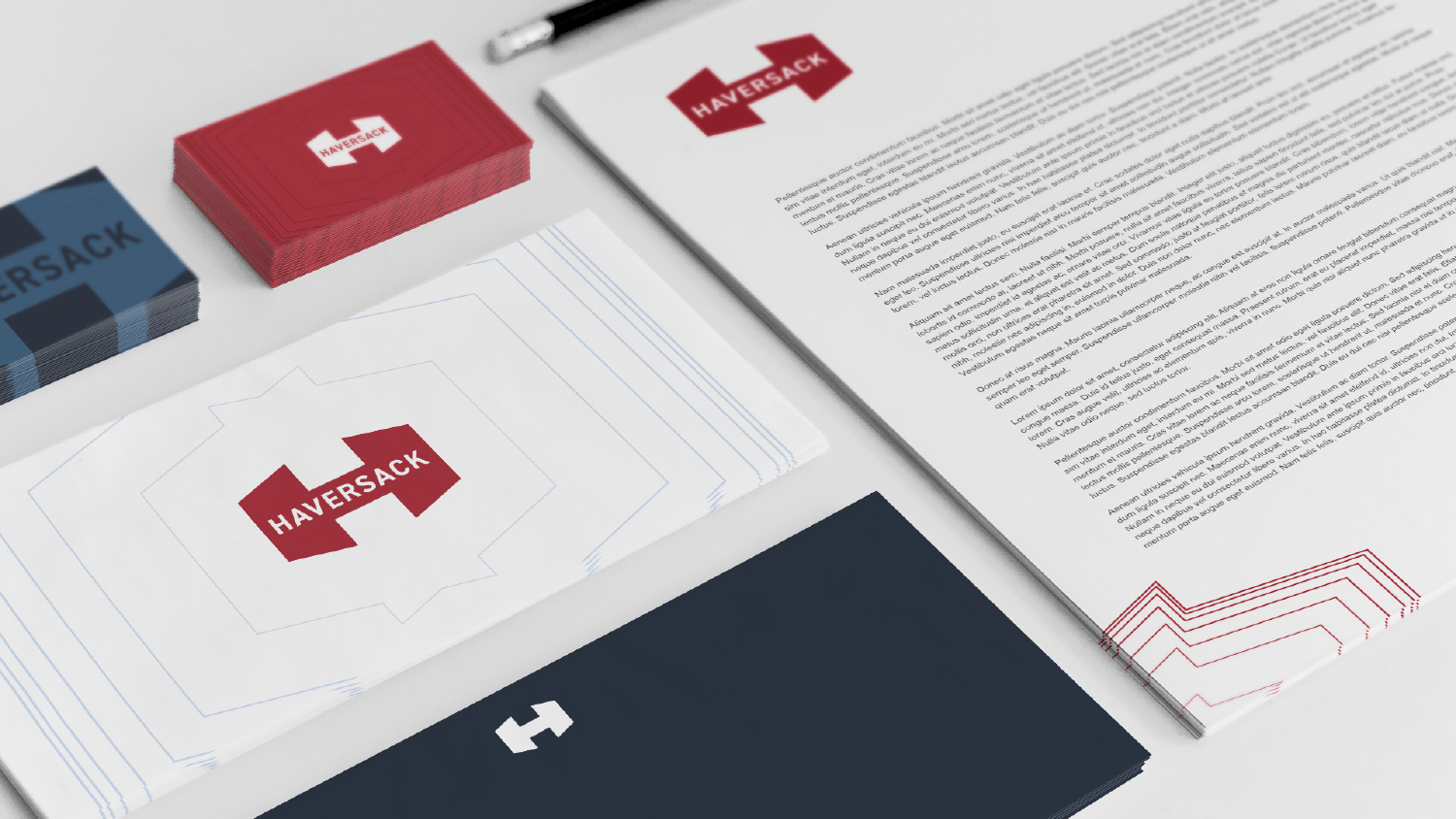
Haversack logo design
A project while at Ginger Griffin Marketing & Design (now owned by Hype Mill Digital), this innovative logistics company aimed to develop a logo that would help them position themselves as a strong and trustworthy entity.
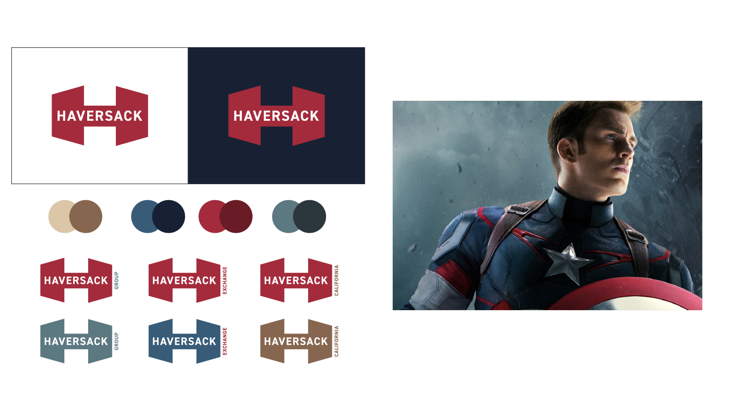
The owner had deep experience in the logistics industry and wanted to pull back the veil on aspects he felt missed an opportunity to be customer-driven. We saw an opportunity to create something bold and meaningful, pulling from our discovery process that showed his passionate desire to be "like the Army" in many ways.


